Infographics- A Muse We Can Use
There’s a lot of talk these days about the value or opportunity represented by the new movement toward informational design, or data visualization; that is, the visual representation of data in an effort to elicit a bigger impact. The most basic every day example used to be taking data from a table in a spreadsheet and converting it into a graph to make the trends inherent in the data more meaningful on a meta level.
Internet pundits, social media evangelists, educators, and modern day doomsday theorists are all offering their own reasons for why informational design is important, but the generally accepted, underlying argument goes something like this: there’s too much information available to us all these days. Therefore, our ability to invest attention in data has declined even as the rates of information available to us have increased. This leads everyone to believe that if we convert information into images, we can more easily consume, digest and use that information. In other words, we need to dumb down the data with pictures and bright colors and arrows in order to comprehend it all.

(Care of http://www.customermagnetism.com/seoblog/wp-content/uploads/2012/05/infographicmarketing1.png)
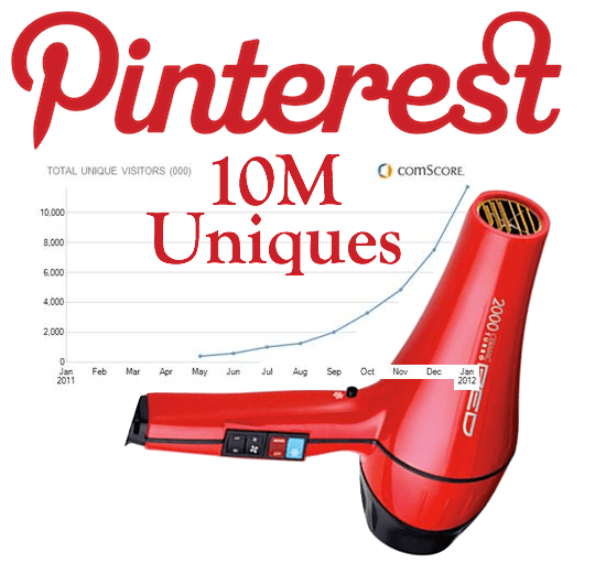
We can blame the recently meteoric rise of infographic popularity on a few likely sources: it’s an election year, a chance to inform and educate the American people on issues that run the gamut, but in a digestible, simplified way that they can take straight to the polls. For most broadcasters, pollsters, PACs and lobbyists, that means stunning visuals and new media toys. On the tech trends side, blame the sale of social photo app Instagram to Facebook for an unheard of sum earlier this year, or the fact that visual scrapbook site Pinterest hit 10 million monthly unique visitors faster than any other social platform in history. If you look at all of this from a very shallow level, the sign seems to point (with a big red, shiny, pulsating arrow) toward a need to make everything visual.

(Care of http://tctechcrunch2011.files.wordpress.com/2012/02/pinterest-blow-dryer-done-52.png?w=540)
As with most new media movements and trends, I recommend slipping one toe very carefully into the waters here. I think there is merit to making some data more visual. There are thousands of examples where informational design is transcendent and deeply effective. However, as if often the case with the execution of a newly trendy web phenomenon, there are more than twice as many examples of infographic abuse (bless you, Tumblr, you’re always there for me).
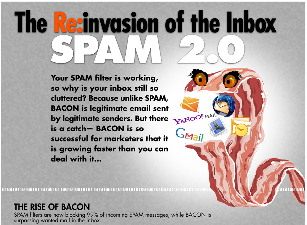
(Care of http://terribleinfographics.tumblr.com/image/9965956069)
So when I saw NYTimes food writer Mark Bittman getting in on the infographic action I approached his take with some skepticism. And yet, and yet, (and here’s where we relate back to the fact that this is an election year and I’ve done my share of political studying) Bittman did something novel here.
Bittman approached the topics of food labels in a recent column in an interesting way, especially for Californians who, in November, will vote on whether to require any food made with genetically modified material to be explicitly labeled as such. In his post, Bittman designed his own recommendation for what the future of food labels should look like in the U.S.
 (Care of NYTimes: http://www.nytimes.com/2012/10/14/opinion/sunday/bittman-my-dream-food-label.html)
In my humble opinion (as a person with absolutely no design background) I think this is a really good start for a simplified look at food labels. I worry about “foodness” and “welfare” as names for those values, I don’t think Bittman has done a great job with naming on those. That said, I think he hits on the right measurements, as what most folks do want to know about their food is a) if it’s good for them and has nutrients, b) if it contains unprocessed, whole foods, and c) what its relative impact on the environment is. I also think the color coding system is a great way of distilling the info down for those who just want a very general guidance for their purchases.
All that said, whether or not I agree with his proposal, I love this example of data design because it represents a visualization that people would be using to make decisions every single day, and because it’s important to get these things right since they will impact everyone in California (and possibly, some day, everyone in the U.S.). Given nutrition data’s links to helping to stem the tide of the obesity epidemic we currently face in the U.S., getting this labeling design right has the potential to be one of the most important health initiatives that our generation faces. And that’s when infographics and data design become invaluable for policy and life choices that we make day in and day out.
What do you think of Bittman’s proposed design for food labeling? Too much data? Wrong data? Not well designed?
